What Quality Percentage Should You Use When Compressing Images?
A quality setting of 80 can be perfect for one image and disappointing for the next.
I ran into this while preparing a recipe site for a redesign. The hero photo of a pasta dish looked excellent at WebP quality 78. Then I used the same setting on a close-up of a spice label and the tiny lettering softened just enough to look cheap. The step-by-step screenshots needed even more care; lower-quality exports made button text look slightly fuzzy on mobile.
The best image quality setting for compression is not a magic number. It is the lowest setting that keeps the details people need to see clean at the image’s real display size.
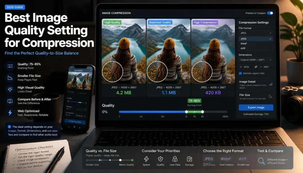
For most website photographs, start at 80–85. Raise the setting for text-heavy screenshots and detailed product images. Lower it for small thumbnails and decorative backgrounds once you have checked the result properly.
Use This Starting Guide
Quality sliders usually range from 0 to 100. Higher numbers keep more visual information and create larger files. Lower numbers reduce file size by discarding more data.
That scale gives you a direction, but not a universal standard. Quality 80 in one image tool may not look exactly like quality 80 in another because encoders handle compression differently. A JPG exported at 80 can also look different from a WebP file exported at 80.
Use these ranges as a reliable first pass:
These are starting points, not rules you apply blindly. A close-up of a textured chocolate cake might need more quality than a clean photo of a bowl on a plain tabletop. A dark image with noisy shadows can also need more file space than a bright image with smooth color areas.
What the Quality Percentage Actually Changes
Lossy compression reduces file size by simplifying image information that the encoder believes viewers are less likely to notice. At moderate levels, the file can become substantially smaller while still looking almost identical at normal size.
Push the quality too low, however, and the changes become visible.
You may see:
-
Blocky patches in flat backgrounds
-
Smearing around hair, leaves, and fabric
-
Fuzzy text in screenshots
-
Color banding in skies, walls, or gradients
-
Halos around high-contrast edges
-
Rough-looking food texture, especially around herbs, crumbs, and glossy sauces
-
Uneven skin tones in portraits
The percentage does not change image dimensions. A 4,000px-wide original at quality 60 still contains 4,000 pixels across. It may be smaller than the original file, but it can remain unnecessarily heavy for a website while showing more compression damage than a sensibly resized image at quality 82.
Resize first. Then set quality.
Best Image Quality Setting for Compression by Use Case
Blog photos and featured images
For a standard article image, begin around quality 80–85 after resizing it to the widest size your content layout actually displays.
A 1,200–1,600px-wide photo is often plenty for a blog post. There is little benefit in uploading a 4,000px camera original if your theme presents it at 1,200px.
For recipe images, inspect the focal area rather than every corner. If the recipe is about flaky pastry, readers should be able to see the layers. If it is a soup recipe, check the edge of the bowl, the garnish, and any steam or texture near the surface.
If your goal is a strict upload limit rather than general page optimization, use a separate target-size workflow. A photo suitable for a blog post may need different trade-offs when you need to compress an image to 100KB without losing quality.
E-commerce and product images
Product images normally deserve a higher starting setting, around 85–90.
Shoppers look for proof in the details. They may zoom into a label, inspect the weave of a fabric, compare a finish, or read printed packaging. A lightly compressed product photo can still be fast. An overly compressed one can make the product look lower quality than it really is.
Use different exports for different placements:
-
Main product gallery: larger dimensions and quality around 85–90
-
Category grid: smaller dimensions and quality around 75–82
-
Related-products card: even smaller dimensions, but still sharp enough to identify the product
One oversized master file for every position is inefficient. One aggressively compressed file for every position is worse.
Screenshots, UI images, and tutorials
Screenshots need a higher range because humans notice tiny defects in interfaces quickly.
A photo can hide small compression changes inside natural texture. A screenshot cannot. A one-pixel line, a menu icon, or a small button label may become slightly soft at quality 75, even when the whole image seems fine at first glance.
Start between 85 and 92 for lossy WebP. For screenshots with code, spreadsheets, small text, diagrams, or dense menus, compare that output against PNG or lossless WebP.
When a screenshot remains too large, crop out unnecessary browser tabs, desktop background, blank margins, and unrelated interface panels before lowering quality. Cutting irrelevant pixels is much kinder to readable text than heavy compression.
Logos and transparent graphics
Do not use the same quality logic for logos that you use for photos.
A logo with transparency should normally remain a PNG or use lossless WebP. JPG removes transparency and can leave a colored halo around lettering and curved edges. Raising JPG quality to 95 does not solve the underlying format problem.
For a transparent brand mark, inspect the asset against both light and dark backgrounds. A logo can look fine on white but reveal rough edges or a faint box when placed over a colored header.
Thumbnails and decorative images
Small thumbnails have a smaller quality budget because they are viewed at a smaller size.
For a 300px-wide card image, quality 70–80 is often worth testing. Fine detail that would matter in a gallery image may not be visible at all in a compact card. The same applies to decorative background images where no one is reading text or studying a product label.
Still, check for obvious damage. A heavily compressed sky can show bands of color. A blurred texture can make a polished site feel unfinished.
A Better Workflow Than Guessing
You do not need to export fifteen versions at random percentages. Use a short, controlled test instead.
1. Set the right pixel dimensions
Start by asking where the image will appear.
For a wide blog image, try 1,200–1,600px. For a product-card image, 600–900px is often enough. For a large hero image, use the width your layout needs, with enough room for sharper displays if your design requires it.
Do not use a quality slider to solve a dimension problem. A 4,032px-wide phone photo exported at quality 55 may still be larger than a 1,400px version exported at quality 85, and the smaller-dimension version will often look better.
2. Create one sensible first export
Choose a setting based on purpose:
-
Article photo: WebP quality 82
-
Food close-up: WebP quality 85
-
Product packaging: WebP quality 88
-
UI screenshot: WebP quality 90
-
Small thumbnail: WebP quality 75
-
Transparent logo: lossless WebP or PNG
If you want to compare file formats before committing, you can make a few clean versions with the ImagArt image format converter and judge them side by side.
3. Inspect the stress points
Do not inspect only the center of the image.
Every image has areas that expose compression artifacts sooner than others. Look at those areas first:
Open the image at its normal on-page size. Then zoom in briefly to catch artifacts that may become more obvious on larger screens.
4. Adjust in five-point increments
If the file is larger than you need, move from 85 to 80, not from 85 to 50.
Small changes are easier to evaluate. You may find that 80 looks identical to 85 at normal display size but produces a worthwhile file-size reduction. If quality begins to fall apart at 75, go back to 80 rather than trying to compensate later.
If the file remains too large at a quality you are happy with, reduce the pixel dimensions slightly or crop unused space. This often gives a better result than lowering quality further.
5. Save the master separately
Never overwrite your original with a compressed web export.
Keep the source image, especially if it came from a camera, a photographer, or a design file. Once you re-export a lossy JPG or WebP several times, artifacts can compound. The next editor may need a larger crop, a print version, or a different format.
A clear folder and naming system prevents expensive mistakes:
-
vegetable-curry-original.jpg -
vegetable-curry-featured.webp -
vegetable-curry-card.webp -
vegetable-curry-social.jpg
When File Size Matters More
Sometimes you do need to work within a hard cap. An email attachment, upload form, marketplace, or application portal may enforce a maximum file size.
In those cases, the quality percentage is only one part of the solution.
For example, if you need to get a photo under 200KB, use the required dimensions and accepted file format first. Then make controlled quality changes. A tightly cropped 700px-wide JPG at quality 80 can look better than a 2,500px-wide JPG at quality 40.
For strict limits, aim below the cap rather than exactly on it. A small buffer helps prevent upload failures caused by rounding or strict validation.
The same logic applies whether the limit is 50KB, 100KB, 200KB, or 1MB. Pixel dimensions, crop, format, and image content all affect how low you can go before visual quality suffers.
Common Mistakes
Using 100 quality for every web image
Quality 100 can create a larger file without giving visitors a visible benefit. It may preserve a little more detail than quality 85, but that difference often disappears at normal display size.
The goal is not to maximize the number. It is to deliver a clean image with a reasonable file weight.
Assuming 75 is always safe
Quality 75 is a common default, not a universal answer.
It can work nicely for a small background image or a simple article photo. It may be too aggressive for screenshots, product labels, face close-ups, and images with high-contrast text.
Exporting a large original at low quality
This wastes pixels and harms detail at the same time.
First resize the original to the display dimensions you need. Then compress moderately. You will usually get a smaller, cleaner final file.
Recompressing downloaded images repeatedly
A file that has already been compressed by a social platform, messaging app, or old website export has less detail left to protect. Another lossy export can make the damage more obvious.
Whenever possible, work from the original source file.
Choosing JPG for an image with transparency
JPG does not support transparency. It can also create halos around logo edges and graphics with hard shapes.
Use PNG or lossless WebP for transparent images. This is a format decision, not a quality-slider decision.
Quick Decisions by Scenario
The best image quality setting for compression is the lowest number that preserves the details your visitor needs at the size they will actually see. It is not the lowest possible file size, and it is not automatically 100.
FAQ
Is 80 quality good for image compression?
For many website photos, yes. Quality 80 is a strong starting point after you resize the image to its real display dimensions. Check close details such as faces, text, foliage, and product labels before publishing.
Should I choose 75 or 85 quality for WebP?
Use 80–85 as a starting range for standard web photos. Quality 75 may be suitable for smaller thumbnails or decorative visuals. For products, portraits, screenshots, and images with important text, start closer to 85 or above.
What quality should I use for WordPress images?
For typical article photos, WebP quality 80–85 works well after resizing to the width your theme uses. For screenshots, begin around 85–92. For transparent logos and crisp graphics, use PNG or lossless WebP rather than lossy photo compression.
Does higher quality always mean a better image?
Higher quality preserves more image data, but it does not always create a visible improvement at the image’s final display size. It can make the file substantially larger. Choose the lowest setting that looks clean where the image is actually used.
Why does the same percentage look different across tools?
Different tools use different encoders and settings. An 80-quality JPG does not necessarily match an 80-quality WebP export, and two different applications can produce different results at the same number. Compare the output visually instead of trusting the label alone.
Choose a Range and Check the Result
Start with 80–85 for standard web photos, raise the setting for screenshots and detail-heavy product images, and test lower values for small thumbnails. If you need a compact image for a specific file-size cap, use the right dimensions and format first, then adjust quality gradually. A few purposeful exports will tell you far more than any one “perfect” percentage.